MENU

M-BIT – Web development

Designing for every device

Responsive web dizajn vs classic design

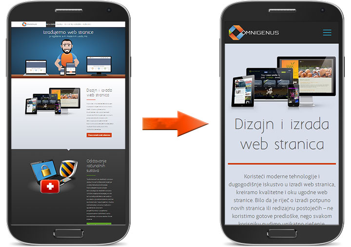
The constantly rising popularity of smart devices has created a serious demand for websites that are viewable on small displays. Responsive web design eliminates the need to change layouts or to re-position the content for your website content to be readable across all platform. Content is the most valuable asset of your website and your responsive website will serve the same content on every device in an appropriate layout which makes it readable to the user. Responsive web design is the reason why some websites almost look like they’ve been exclusively built for the device you’re using to browse the website. It’s the solution to eliminate the users need to pinch out, zoom in, and fiddle with the websites to get the information they need. Responsive design helps load what customers need and M-BIT is here to create it for you.

Why do we love responsive design?

  • POSITIVE USER EXPERIENCE

    According to Google’s Think Insights on Mobile, if a user lands on your mobile website and is frustrated or doesn’t see what they are looking for, there’s a 61% chance they will leave immediately and go to another website. Having to squint, pinch, or fiddle with a website just to read the content is surely something that can make a visitor angry and frustrated. With responsive design that’s a thing of the past.
  • SIMPLE MAINTENANCE

    Stick with the exact same style across your website. There’s no need to change layouts or to re-position the content, all you need to do is to add or edit your content!
  • ALL IN ONE PLACE

    Every link leading to a separate page on your website is the same for all devices, making website pages sharing simple. In the same time that helps you to gather precise visitors statistics.
  • SEARCH ENGINES LOVE IT

    Google prefers responsive web design over mobile templates. Having one single URL makes it easier for Google bot to crawl your site and Google’s external link algorithm and reduces the chance of on-page SEO errors!
  • SAVES TIME AND MONEY

    Setting up a responsive site costs is less expensive than the alternative – building separate sites designed to handle different devices. Separate sites require separate content strategies and maintenance for each. The cost to develop a separate website version for mobile devices outweighs it’s usability and complicates things when it comes to content updates.

Mobile website vs. responsive web design

Responsive web design means that the site’s code automatically detects user’s device screen resolution and delivers a view optimized to take advantage of it. In particular, reacting to the width of the browser window. On the other hand, a mobilized website is designed specifically for mobile devices, smartphones in particular. Building a responsive site is less expensive than doing two seperate websites, but it also means you don’t have to maintain separate code bases or websites, while the look-and-feel and the user experience is consistent on any platform, and any form factor will deliver a good experience. On top of that, you can manage the whole site via a CMS, so you don’t need any manual intervention from developers to make changes or to create new pages on your website. Also, responsive design will surely be less expensive to maintain. The main problem with mobile-only website is designing for specific phones and handsets, while responsive design is more flexible.

Croatian snow sports instructors and trainers association
Fight Site
Final Fight Championship
Fight Channel

Are you interested in responsive design?

Contact us, we can help you